
HomePage » Smart Agent – Career Counseling
UI design
Mobile App (iOS & Android)
Tools: Figma
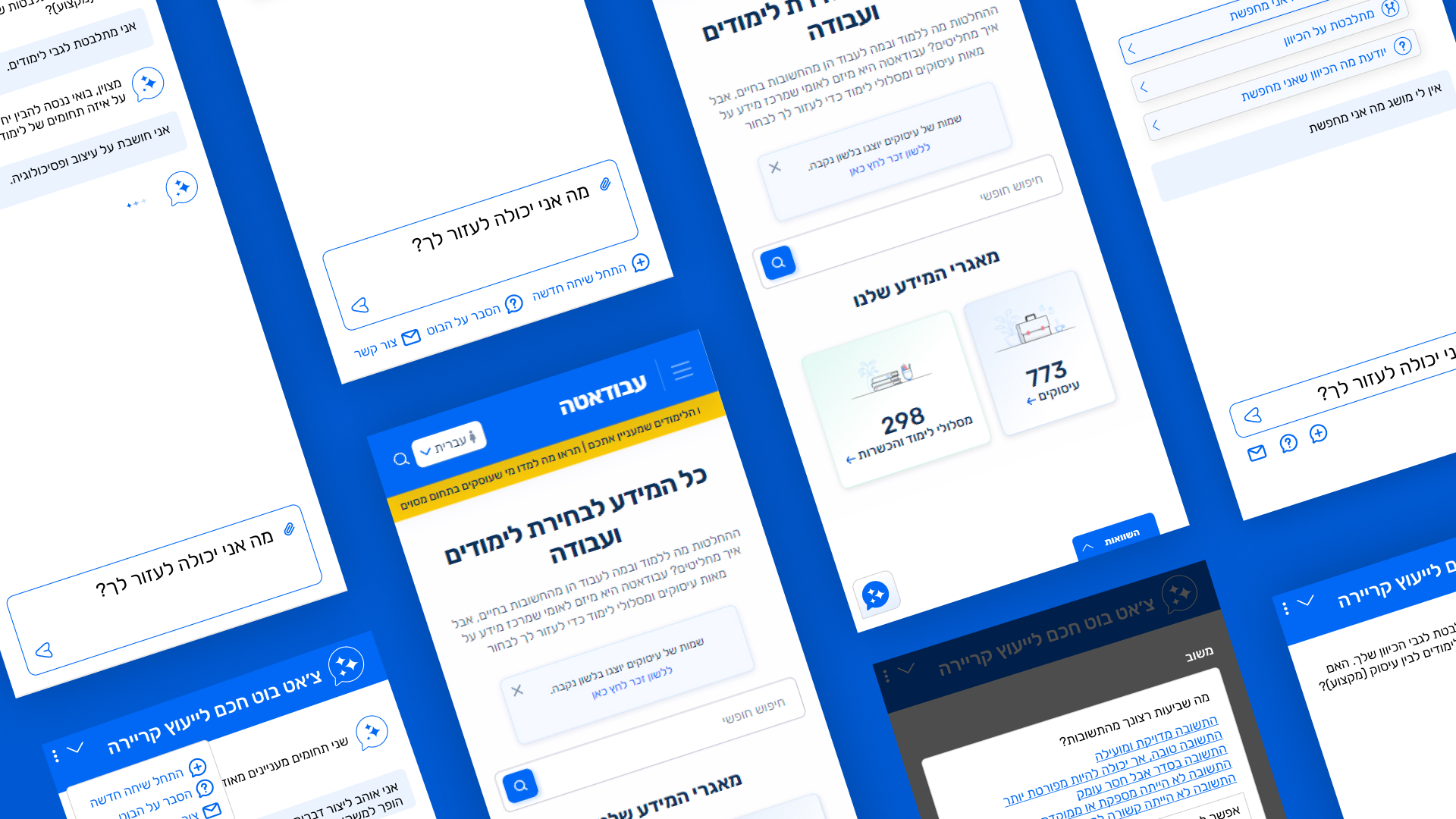
To solve this challenge, a “Smart Agent” was conceptualized and designed. This interactive, AI-driven chatbot acts as a personal virtual career counselor. The bot delivers database information in a modular, step-by-step manner, enabling users to refine their interests and discover specific jobs and study paths tailored to their readiness and areas of expertise.
The chatbot was designed as an seamless extension of the “Avodata” core Design System. Utilizing the platform’s brand palette of deep and light blues establishes authority, professionalism, and institutional trust. Concurrently, clean white backgrounds, minimalist stroke icons, and rounded corners soften the interface, making the conversational experience friendly, modern, and highly approachable for the general public.
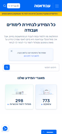
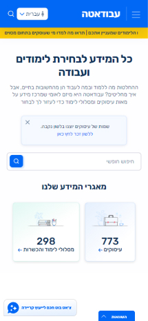
Progressive Call-to-Action : On the initial homepage (file “1.jpg”), the chatbot appears as a minimalist floating icon to avoid disrupting the primary browsing experience. In the next state (file “2.jpg”), a tooltip expands displaying: “Smart chatbot for career counseling.” This micro-UX interaction significantly increases engagement and click-through rates by instantly communicating the widget’s value.
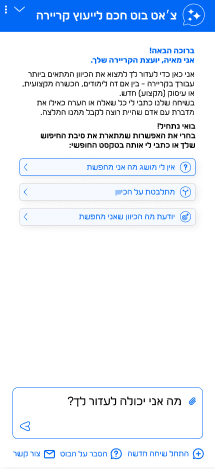
Tailored Gender Adaptation & Conversational Copy: The system utilizes a personalized tone. As seen in the onboarding screen (file “3A.jpg”), the bot introduces itself with a humanized persona (“I am Maya, your career counselor”) and addresses the user with gender-specific language, while maintaining accessibility by allowing users to toggle gender phrasing with a single click.
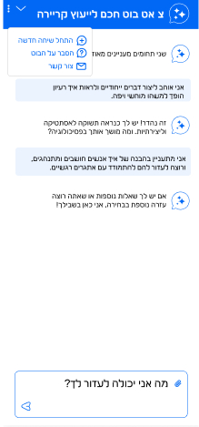
Persistent Control Menu: At the bottom of the chat panel (file “3A.jpg”), fixed action buttons are integrated: “Start a new conversation,” “Feedback on the bot,” and “Contact us.” This design decision ensures the user feels in complete control and provides a UI safety net to reset the workflow or escalate to a human representative at any time.
To reduce cognitive load, the interface goes beyond a blank text input by offering pre-defined Quick Reply buttons based on three primary user personas:
The Uncertain Persona (“I have no idea what I’m looking for”):
This path guides the user through a broad diagnostic and filtering workflow based on personal interests and skills.
The Hesitant Persona (“I am debating between directions”):
This path facilitates a targeted, side-by-side comparison between two or three professions to help the user make a final decision.
The Focused Persona (“I know what direction I’m looking for”):
This path allows rapid filtering by specific areas of expertise (e.g., technology, healthcare, finance) to jump straight to relevant jobs and training tracks.
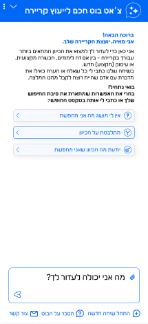
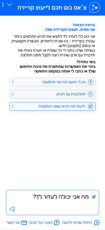
To reduce cognitive load, the interface goes beyond a blank text input by offering pre-defined Quick Reply buttons based on three primary user personas:
The Uncertain Persona (“I have no idea what I’m looking for”):
This path guides the user through a broad diagnostic and filtering workflow based on personal interests and skills.
The Hesitant Persona (“I am debating between directions”):
This path facilitates a targeted, side-by-side comparison between two or three professions to help the user make a final decision.
The Focused Persona (“I know what direction I’m looking for”):
This path allows rapid filtering by specific areas of expertise (e.g., technology, healthcare, finance) to jump straight to relevant jobs and training tracks.
Before: A static floating chat icon in the corner of the screen easily blends into the background, causing many users to overlook it or misunderstand its purpose.
Your Improvement: You implemented a progressive disclosure workflow. Shifting from a minimalist icon (as shown in file “1.jpg”) to displaying a targeted tooltip that reads “Smart chatbot for career counseling” (as shown in file “2.jpg”) catches the eye in a subtle way, immediately communicates the value of the tool, and drives user action much more effectively.
Before: Interacting with standard search bars or generic bots often feels detached, mechanical, and alienating.
Your Improvement: You gave the bot a warm, humanized persona (“I am Maya, your career counselor”) that establishes immediate trust with the user (as shown in file “3A.jpg”). Furthermore, you elegantly resolved the challenge of gender-specific phrasing in Hebrew—the bot addresses the user in a tailored manner by default while maintaining full accessibility by allowing gender settings to be toggled with a single, clear click.
Before: In many chat interfaces, if a user makes a mistake or wishes to change the direction of the conversation, they get stuck in a loop or are forced to refresh the entire page, losing all their progress.
Your Improvement: You added a persistent navigation menu at the bottom of the chat panel with essential quick actions such as “Start a new conversation” and “Contact us” (as shown in file “3A.jpg”). This design element acts as a permanent safety net, prevents frustration, and ensures the user always feels in complete control of the process.
Before: The website offers a general search bar that floods the user with hundreds of raw results and long-form documents at once, making it difficult to isolate specific areas of expertise.
Your Improvement: The new interface transforms the chat into an intelligent filter. It guides the user step-by-step, requesting relevant details only when necessary, and makes it simple to discover specific jobs and training tracks based on distinct domains without getting lost in the site’s vast underlying databases.
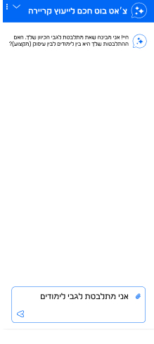
Screen Overview: The beginning of a choice-based interaction. The user selected the “I’m debating between directions” quick reply, and the system automatically pushes the text “I am debating regarding studies” into the chat bubble. The bot immediately acknowledges the input.
UX Reasoning: Utilizing an Echoing pattern. When a user clicks a quick reply, their choice is mirrored back into the chat flow as a sent message. This provides immediate visual feedback that the action succeeded and maintains a natural dialogue flow rather than a cold form-filling experience.
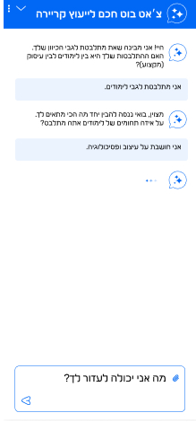
Screen Overview: Deepening the dialogue and guiding toward a targeted filter. The bot asks the user to define their interests (“Which study areas are you debating between?”), and the user replies with free text: “I’m thinking about design and psychology.” The system then displays a typing state (three blinking dots).
UX Reasoning: Displaying a Typing Indicator while the AI processes the raw text input. This micro-UX element is critical for sustaining the illusion of a human-like conversation. It prevents the user from assuming the interface has frozen and builds positive anticipation for the upcoming response.
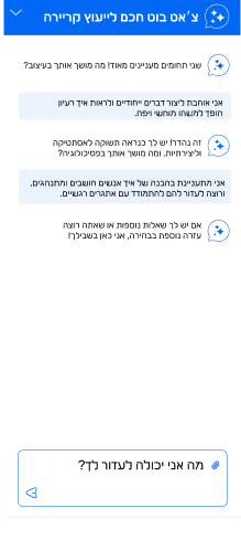
Screen Overview: The diagnostic and drill-down process. The bot analyzes the two domains entered (design and psychology) and asks targeted questions about what draws the user to each area in order to uncover their underlying motivations.
UX Reasoning: Instead of instantly flooding the screen with an extensive list of courses, the interface employs a Progressive Profiling strategy. The bot deconstructs the dilemma into digestible sub-questions, allowing the conversational AI to deliver a highly accurate and personalized career match in the subsequent steps.
Screen Overview: Displaying structured, personalized results. The bot delivers a comparative analysis derived from the platform’s database for the chosen fields (e.g., Cinema and Psychology), highlighting the role definitions, required degrees, and average market salary. Quick feedback buttons (Thumbs Up/Down) are placed below.
UX Reasoning: Utilizing a Structured Info Card pattern. Complex regulatory and employment data is rendered highly scannable through bold typography and isolated salary figures. Integrating immediate micro-feedback elements empowers users to rate the answer’s quality, directly optimizing the machine learning model over time.
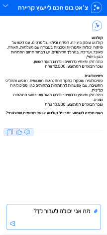
Screen Overview: Displaying structured, personalized results. The bot delivers a comparative analysis derived from the platform’s database for the chosen fields (e.g., Cinema and Psychology), highlighting the role definitions, required degrees, and average market salary. Quick feedback buttons (Thumbs Up/Down) are placed below.
UX Reasoning: Utilizing a Structured Info Card pattern. Complex regulatory and employment data is rendered highly scannable through bold typography and isolated salary figures. Integrating immediate micro-feedback elements empowers users to rate the answer’s quality, directly optimizing the machine learning model over time.
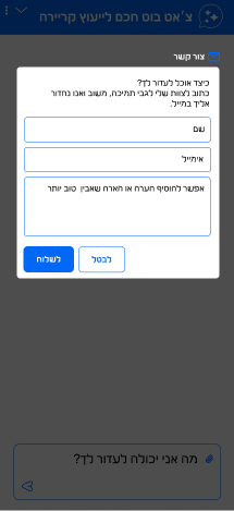
creen Overview: Launching a contact modal window. When the user selects “Contact us” from the menu, an overlay pops up within the chat area, prompt fields for Name, Email, and a message textbox for follow-up support.
UX Reasoning: Creating a Human Escalation Path. In automated bot workflows, it is vital to prevent dead-ends. If the virtual assistant falls short, the interface presents a clear, frictionless gateway to human operators without forcing the user to abandon the chat panel environment.
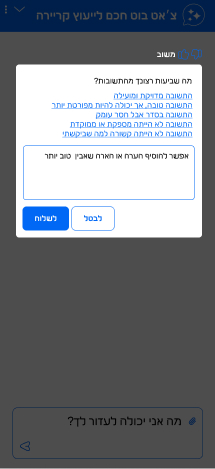
Screen Overview: A dedicated qualitative feedback modal. Triggered by a negative thumb-down click (from screen 7), a window prompt pops up requesting the user to specify the cause of dissatisfaction via multi-choice options paired with a text field.
UX Reasoning: Capturing targeted quantitative and qualitative UX data in real time. Rather than settling for a generic negative signal, the micro-survey prompts the user to pinpoint whether the answer was incomplete, irrelevant, or inaccurate, delivering highly actionable feedback to product managers.
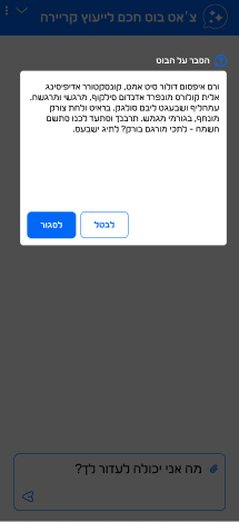
Screen Overview: An informational overview (“About the bot” modal). A modal window pops up providing a brief summary of the bot’s capabilities, the data sources it relies upon (“Avodata”), and relevant disclaimers or technical clarifications.
UX Reasoning: Establishing Transparency and Trust. Users making high-stakes decisions about their career paths must know the origin and reliability of the data. Making the bot’s framework and background easily accessible reinforces user confidence in the accuracy of the insights provided.
WHO’RE THE USERS
The Personas

Context & Mental State: Maya feels social pressure to start her academic degree, but she has absolutely no clue what interests her or what career path to choose. The massive variety of choices in the market leaves her feeling completely overwhelmed and disoriented.
Her UX Need: She requires a broad diagnostic workflow and an onboarding quiz. Her path in the chat will guide her through friendly questions about her interests (working with people vs. working with computers), personal skills, and preferred lifestyle to gently distill initial directions without inducing stress.

In a relationship (cohabiting). A young professional working temporary jobs or considering a major pivot.
Context & Mental State: Omer has already done some initial brainstorming and narrowed his choices down to two specific fields (e.g., debating between Graphic Design and Psychology). He feels stuck because he lacks the practical, comparative data needed to make a final decision and move forward.
His UX Need: He needs a structured comparison workflow. The chat will prompt him to enter the domains he is debating between and present concrete, side-by-side data—such as admission requirements, study duration, and average market salary metrics—empowering him to make an informed, calculated choice.

Married with 2 children. Currently working in administration and looking to make a targeted career transition.
Context & Mental State: Michal has no time to waste on general diagnostic questionnaires. She knows exactly which ecosystem she wants to target (e.g., the Tech and SaaS industry) and uses the platform specifically to discover sub-specialties, relevant courses, or market demands that can fit into her busy schedule as a working mother.
Her UX Need: She requires an optimized shortcut and rapid filtering (Fast-Track Filtering). Her flow will bypass general onboarding steps and lead her directly to specific category selections or keyword inputs, fetching jobs, training paths, and data strictly within her chosen domain of expertise.